logo by Cole Williams
Web Design, UX / UI
Design a website worthy of the awesome work and unique spirit of Seattle Central Creative Academy's graduating Class of 2018.
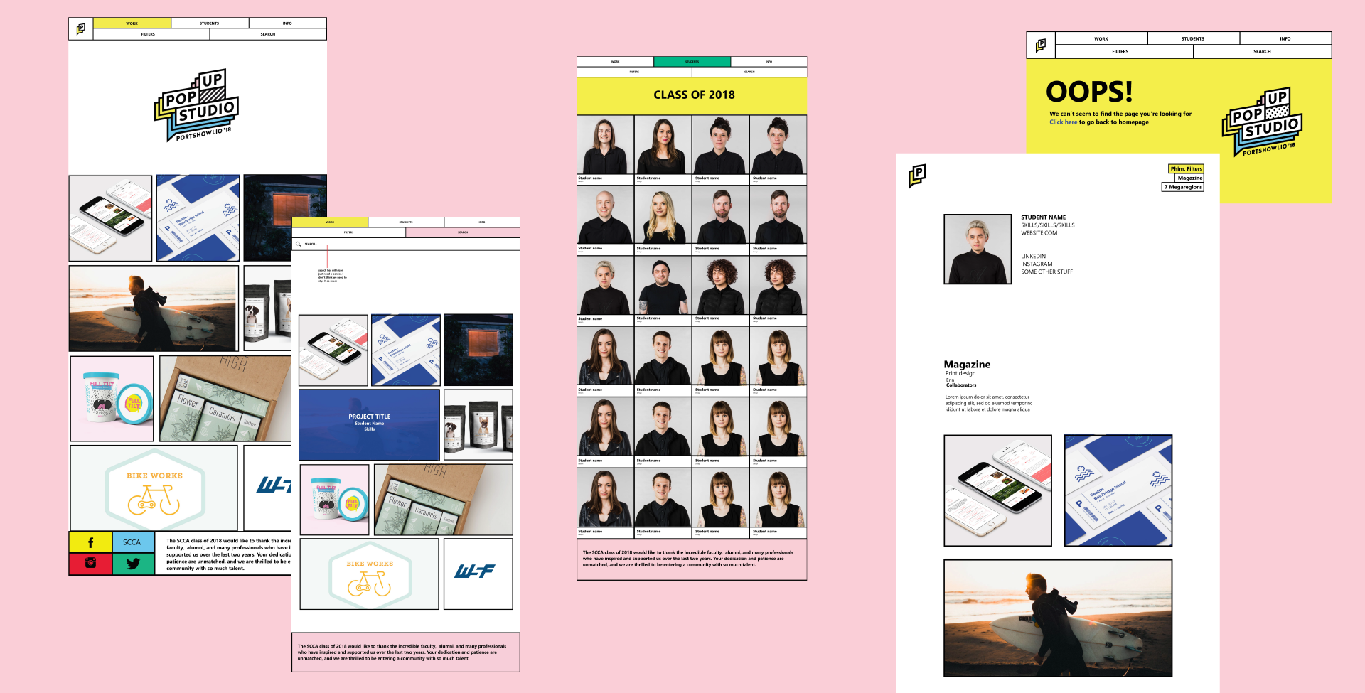
Known for our collaborative spirit and professionalism, the class of 2018 chose to present ourselves as a Pop-Up Studio for our two-day portfolio show. My team was tasked with creating a custom wordpress site to promote the event based on branding created by the team lead by Nina Wesler, with guidance from our steering committee Kira Shea, Kate Reingold and Xio Lugo.
Launch a site featuring work created by each graduating student, a week before the show opens.
Team Lead
UX Design
10 Weeks

courtesy of Anna Atiagina
Making a Splash (Page).
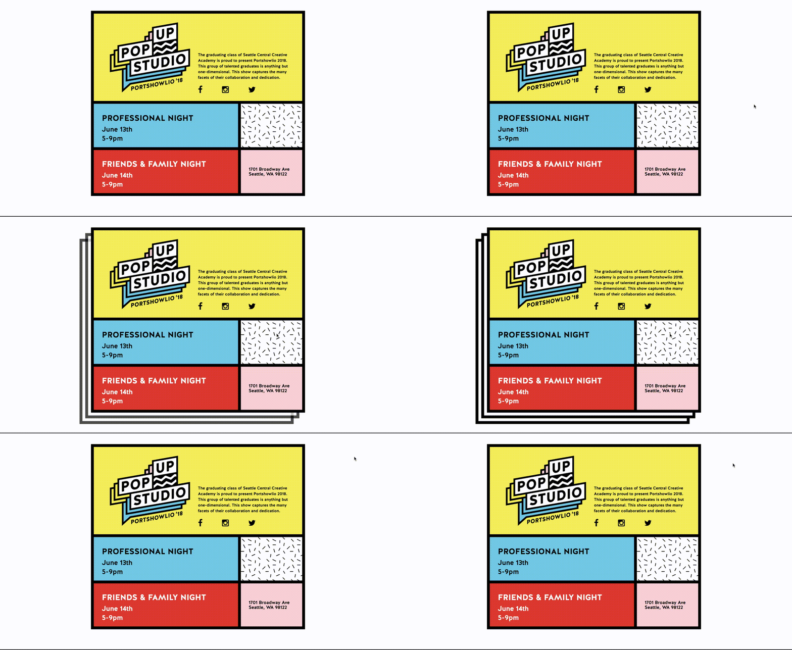
Our first task as a team was to launch the 2018 splash page to inform and generate excitement for the show. I lead Newie, Bill and Ivanna in a sprint to design the page, then consulted with the branding and marketing team leads to finalize a page for Anna to code. She was able to code it quite quickly, and later repurposed the stacked pseudo-element hover effect for the buttons on the main site.
Shout out to the Dream Team.
With Newie taking the lead on concept design, Bill and Ivanna bridging the designer-developer divide with CSS support and Anna weaving wordpress wizardry with PHP and javascript, the site's front-end came together quickly. As a project lead, I was very lucky to have a team that delivered solid work consistently on a tight schedule.


Recognition over Recall
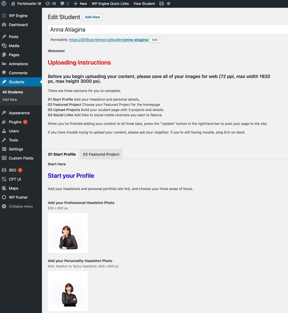
While the designers and developers worked out the site's visual design, I sat down and tested the upload dashboard interface with some of the site's back-end users. The CPT-UI structure we inherited had detailed instructions, but they were all grouped at the top of a long form, and the form fields were named in ways that were intuitive to the developer, but not the user. In our test, it took 30 minutes for our user to upload the minimum requirements for a page on the site.
Responding to this, I reorganized the CPT UI to group information more closely with the fields it related to, in order to prompt our dashboard users with information just before they were going to need it. Additionally, I renamed the form fields from the user's perspective, making it easier for all 44 students to eventually upload their work to the site.

The 2018 Portshowlio website launched June 1, two weeks before the main event.
Thanks to some incredible teamwork by the web team, as well as some great hustle from the entire class of 2018, every graduating student's work made it on to the site.