HoloLens image courtesy of NASA
AR / XR, UX / UI
Build an instructional or educational experience around a wearable AR device
The Museum of Flight in Tukwila, Washington is the world’s largest independent non-profit air and space museum. Founded originally to preserve the aerospace technological heritage of the Pacific Northwest, their collection has grown to over 15,000 artifacts. The Museum’s mission is to acquire, preserve and exhibit historically significant air and space artifacts; to provide a foundation for research and lifelong learning programs that inspire an interest in and understanding of science, technology and the humanities.
Harness Microsoft Hololens technology to create an enhanced museum experience through augmented reality.
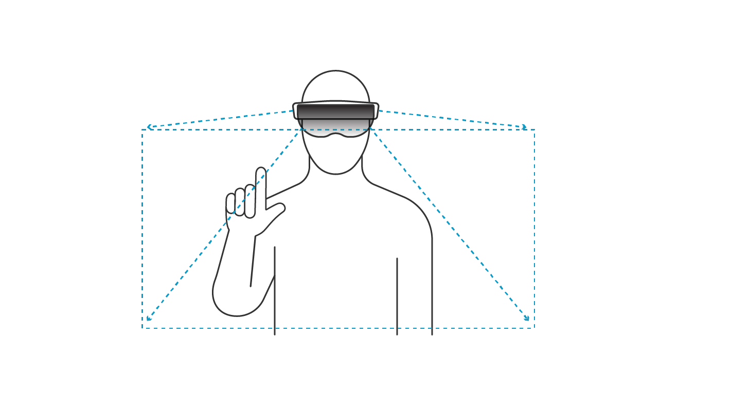
FARTHER uses HoloLens AR / XR technology to inform, assist and inspire visitors to the Museum of Flight.
Flight Augmented Reality Through HoloLens Experience Repository (FARTHER) draws on the museum's extensive collection of aerospace media and artifacts. After visiting the museum space, we designed an experience concept specifically adapted to the human and environmental challenges of implementing HoloLens technology in the museum space.
Most users will have limited if any prior experiences of AR headsets or systems; our product must be simple and intuitive to learn and use.
Based on our research and out of consideration for other museum visitors, we decided to prioritize the graphical/gestural interface over voice interface. Since our users need to learn the system quickly, we designed a brief on boarding tutorial to introduce the basics of the Gestural interface to the user. Although its fairly intuitive, we began by introducing the concept of “gaze”: basically, you need to look at something to interact with it.

In order to keep onboarding quick, we kept our gesture library restricted to a total of 3 primary gestures. Each of these would be introduced sequentially to users in a tutorial level at the entrance to the museum.
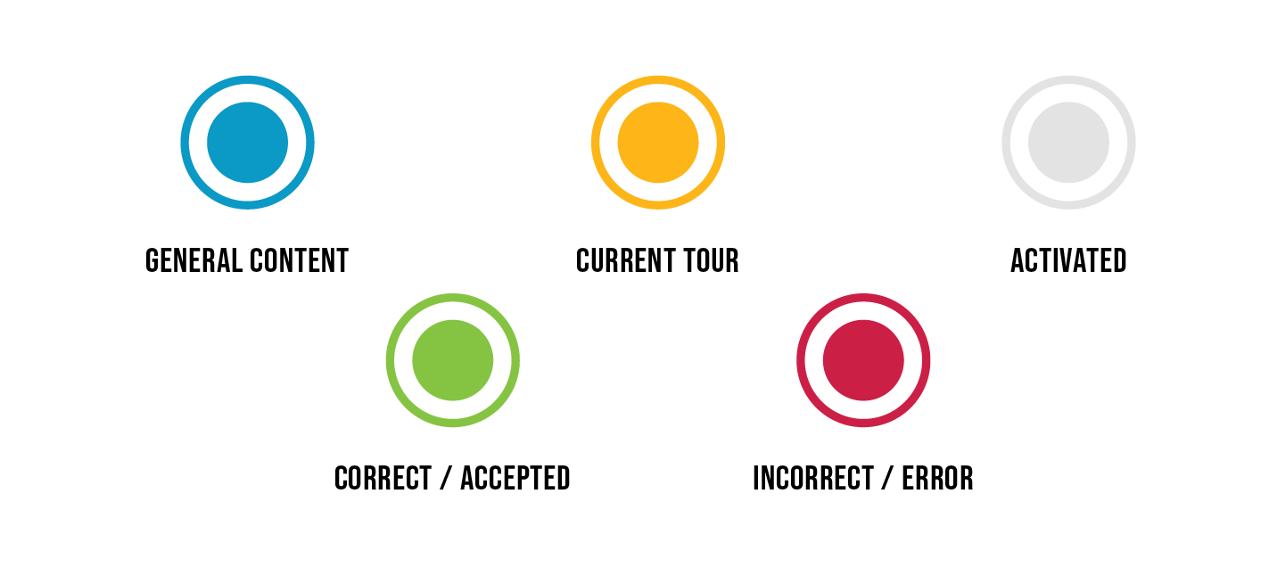
Using the Museum’s brand palette, we created a color-coded system for visual content within the museum. By default, content appears in blue, so as to be observable but not overwhelming. Selected or activated content appears in white for maximum visibility. Yellow is used to highlight information when a tour is active.

The Museum spans two sides of a busy roadway; our system should assist the user in navigating a large and complex campus in order to gain the full experience.
To help FARTHER users navigate the campus, we offer our users the opportunity to select their tour at the start of the experience. The system would offer themed tours based on different subjects featured within the museum.
Our product must function in crowded spaces without being disruptive to other visitors.
In order to minimize disruption to our users as well as other visitors, the FARTHER experience is designed to be operated entirely through gesture, with no voice input required from the user at any point. However, in order to make the system accessible to everyone, we included a limited voice command functionality.
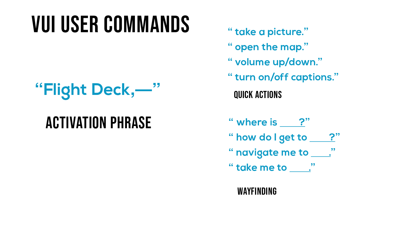
Most actions performed through the VUI are quick actions, which, if the system has understood correctly, will yield immediate visual feedback. When FARTHER recognizes the user speaking it's activation phrase, "Flight Deck," the system immediately springs into action, rendering the action in the user's vision so that they know the command has been understood.
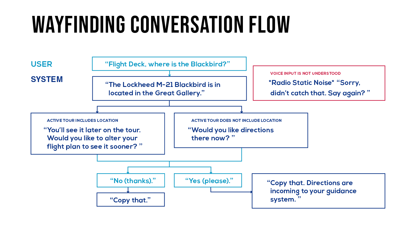
Voice commands that involve navigation do require a bit of simple back-and-forth dialogue with the system.
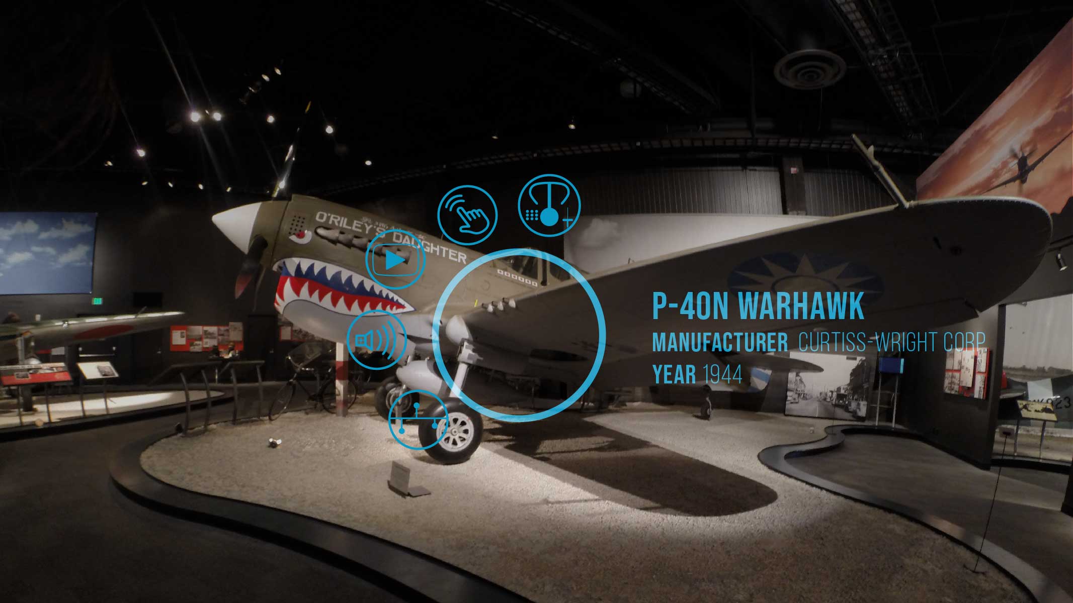
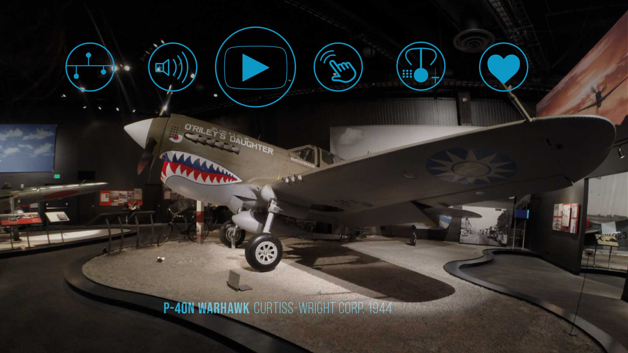
The museum space has already been designed for visual interest; content must be easily discoverable overlaying the existing environment without obscuring the environment or overwhelming the user.
In order not to overwhelm our user, AR-enhanced exhibits appear as targets that the user can direct their gaze at if they would like to engage. Gazing at an object opens a small circular menu similar to a hover state, which hints to the user what type of content is included in that exhibit.
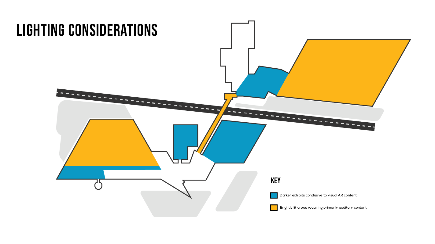
The Hololens headset display renders objects via an additive light display; our content offerings will need to be tailored to the lighting environment of each unique exhibit space.
Due to lighting conditions, some areas of the museum are more suited than others to visual content. In spaces like the Great Gallery, which features a lot of natural light, complex visuals will be difficult to see. For these areas, we prioritize audio content and interaction, like challenging visitors to identify the plane by it's engine sound.