UX / UI, Visual Design
Re-conceptualize the Washington State Department of Motor Vehicle Licensing user experience as remote, on-demand service.
Going to the DMV has become a shorthand for “a long, inconvenient process”. As density in the City of Seattle increases, the offices of Washington State’s Department of Licensing are being displaced. With locations vanishing across the state, our team worked to create a new, convenient way for users to access these essential government services.
Create a delivery model for DMV licensing services that:
Increases efficiency and convenience for users
Complies with Washington State licensing regulations
Can be accessed without ever visiting a specific state office
Tell us how you really feel about the DMV.
Our team began by surveying users about their past DMV experiences in order to get a better sense of the expectations and pain points of the current system. on a 5-point scale from Terrible to Excellent, users most often rated their overall DMV experiences as a 3, trending slightly more positive for customer service, but leaning negative in convenience, duration and efficiency.
Basically, our user’s main problem is that the process of visiting the DMV inconvenient and slow.
When we asked users about the idea of a remote, on-demand DMV service, we found 97% expressed interest in the convenience a remote service, and most of our users said they would be willing to pay $35-55 extra for it.
A Service with access for All.
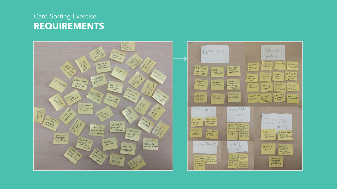
Because RUNDMV replaces a government service that anyone might use, we approached the design of our product with accessibility at the top of our minds. As a team, we worked up a range of requirements in order to meet the needs of users of all abilities, languages and other special circumstances.
Convenience starts online, on your own time.
From our requirements, we created a service model that divided the necessary transactions that make up a DMV visit into two categories; those that could be accomplished online, and those that required an in-person interaction. Our goal was to do as much online as possible, so that users are able to accomplish those tasks on their own time.
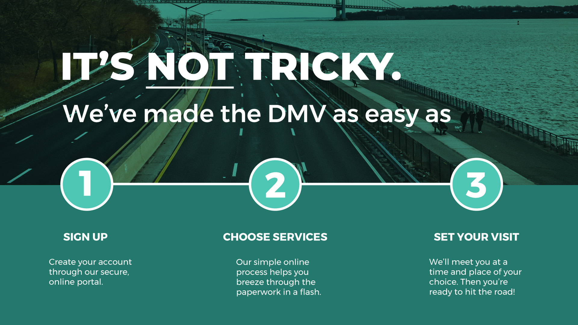
To explain the RUNDMV process to users, we broke the online portion down into three main steps, which we would expand on further in the user journey and prototyping stage.
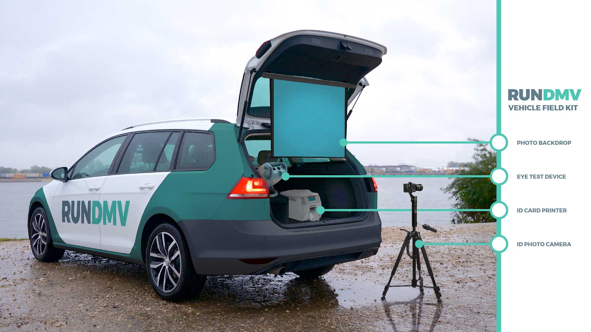
The DMV: On-Demand, in a Van with the RUNDMV Visit Vehicle.
Our concept for the RUNDMV Visit Vehicle required the capacity to perform any task that the user might need to do in person. Operated by our friendly staff, the RUNDMV Visit Vehicle would meet our users at the date, time, and location of their choosing; and is equipped to perform state-mandated vision testing, practical driving skills exams, and ID photography, all on the go.
Who Really Needs the DMV?
As a team, we broke down the user stories based on state legal regulations for licensing. Out of these cases, we identified four total scenarios in which the user would be interacting with the Washington State Licensing system for the first time. Users whose stories fell into these four categories would need the most education on how to use the system. While Michelle and I established visual palette and branding, Anna created personas based around our four user stories.
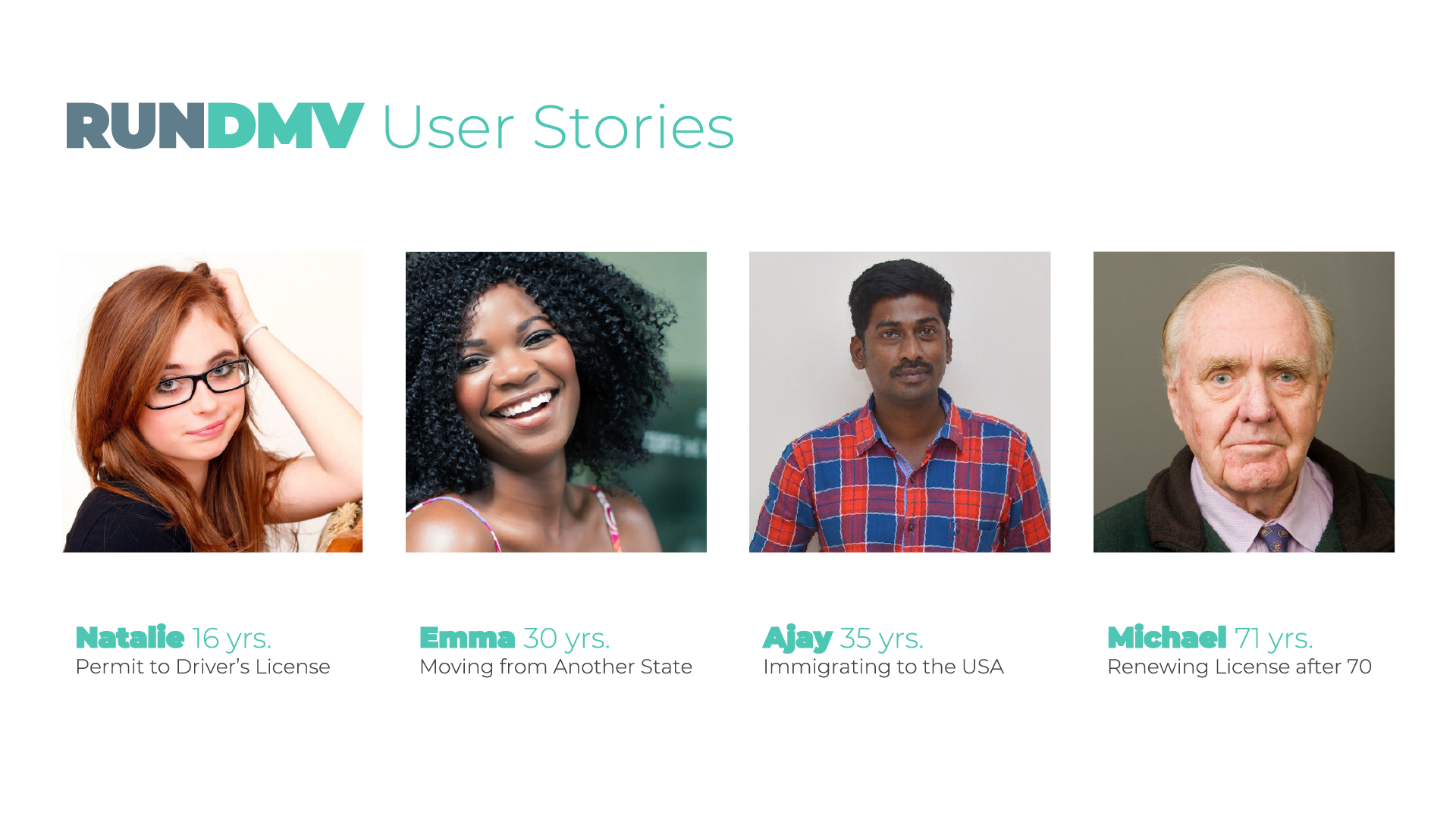
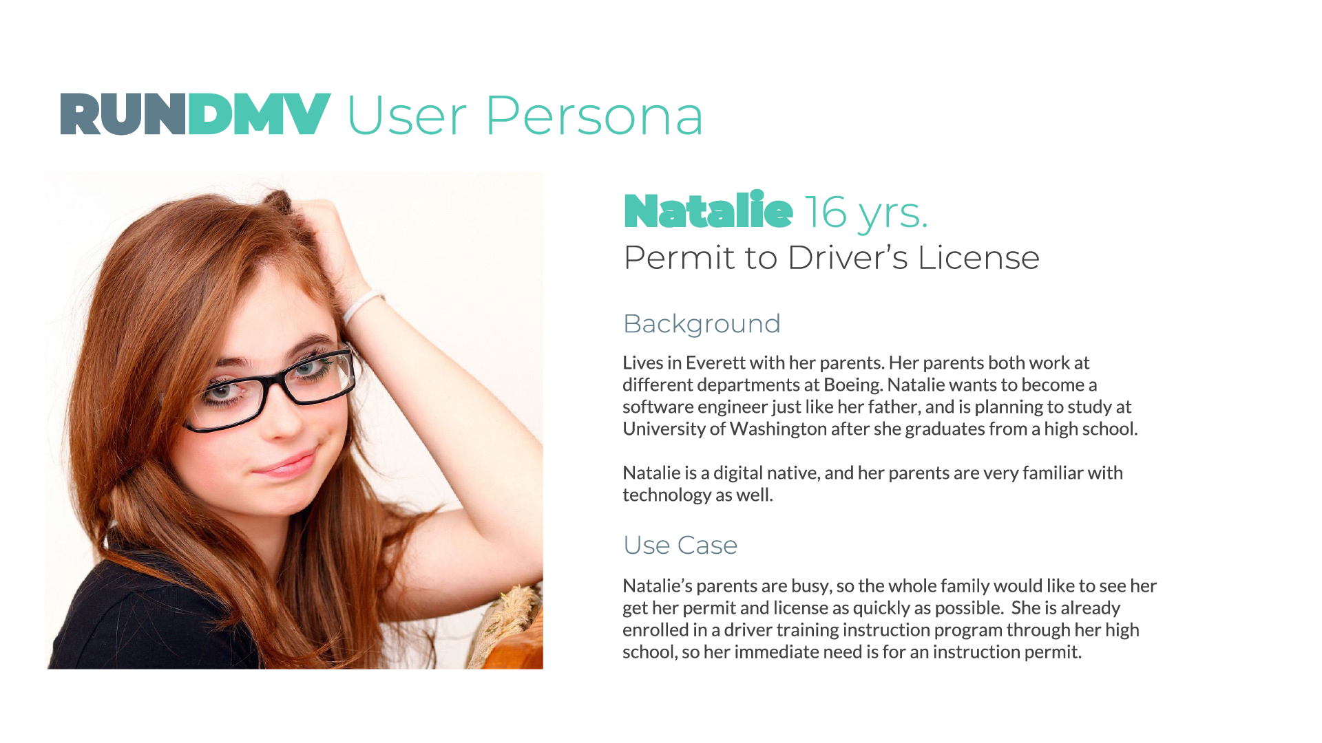
Getting Natalie from instruction permit to driver's license.
Of the personas we identified, Natalie’s case is most complex, requiring multiple visits to accomplish, so we determined that solving the user flow for Nat would solve most of the design solutions for our other users as well.
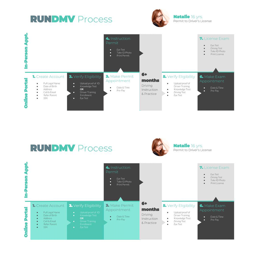
The first three stages of Natalie's user journey are similar to most new users, with slightly increased complexity because she is under 18.
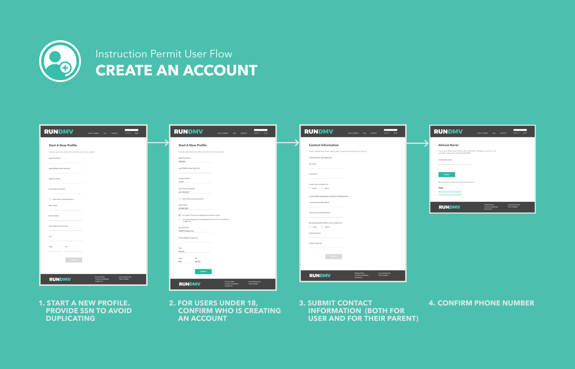
We decided to focus our efforts on prototyping on the first stages of Natalie's user journey, from account creation through setting her first visit.
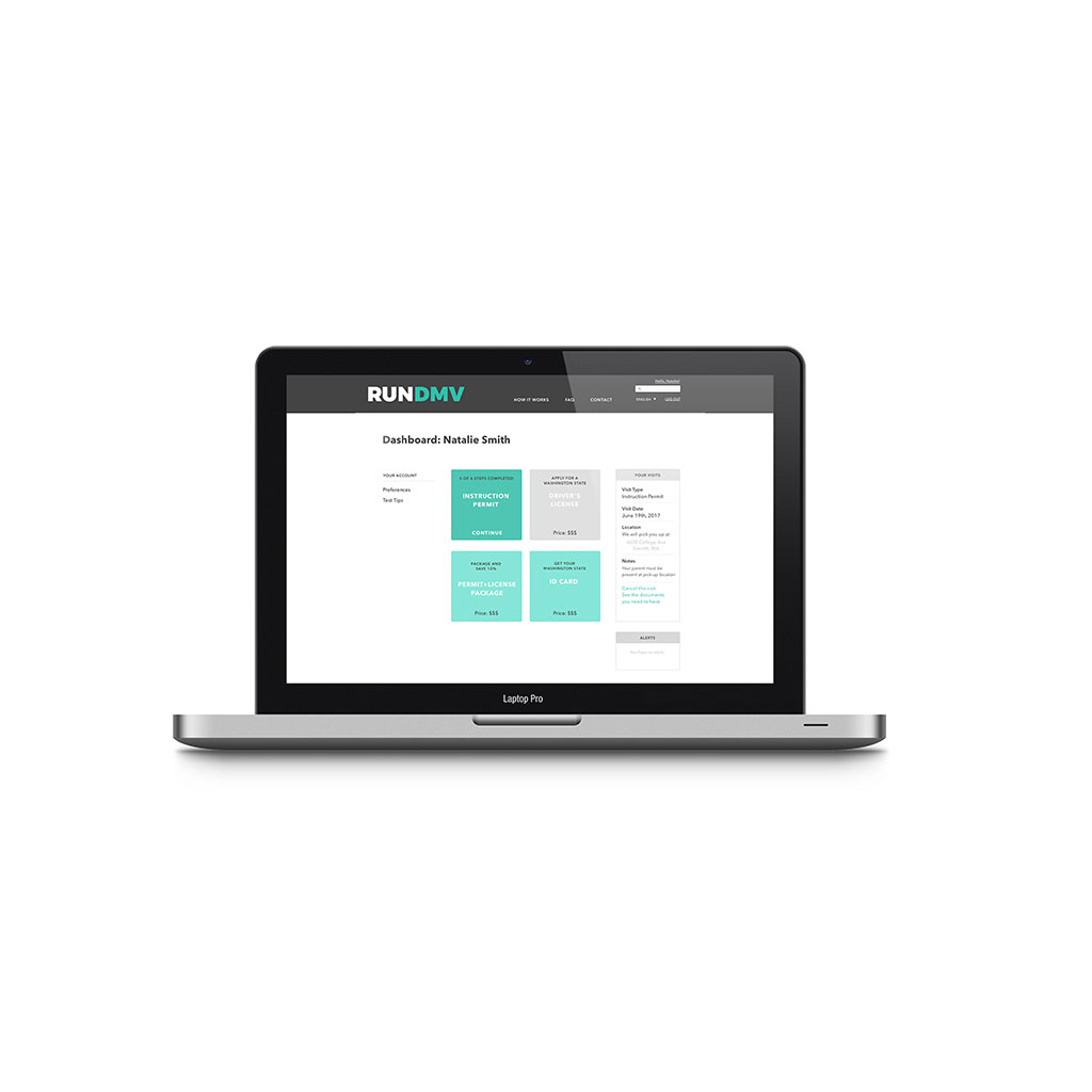
Using Sketch and InVision, our team built out a prototype of the online portal from account creation to setting a first RUNDMV visit.
Following our user persona Natalie’s journey to reach her goal of getting her learner’s permit, we iterated through low-fidelity wireframes to help determine the most logical sequence for the steps the online portal would take. We opted to build our prototype in desktop scale because most people use desktops for similar "official" activities, like paying taxes.
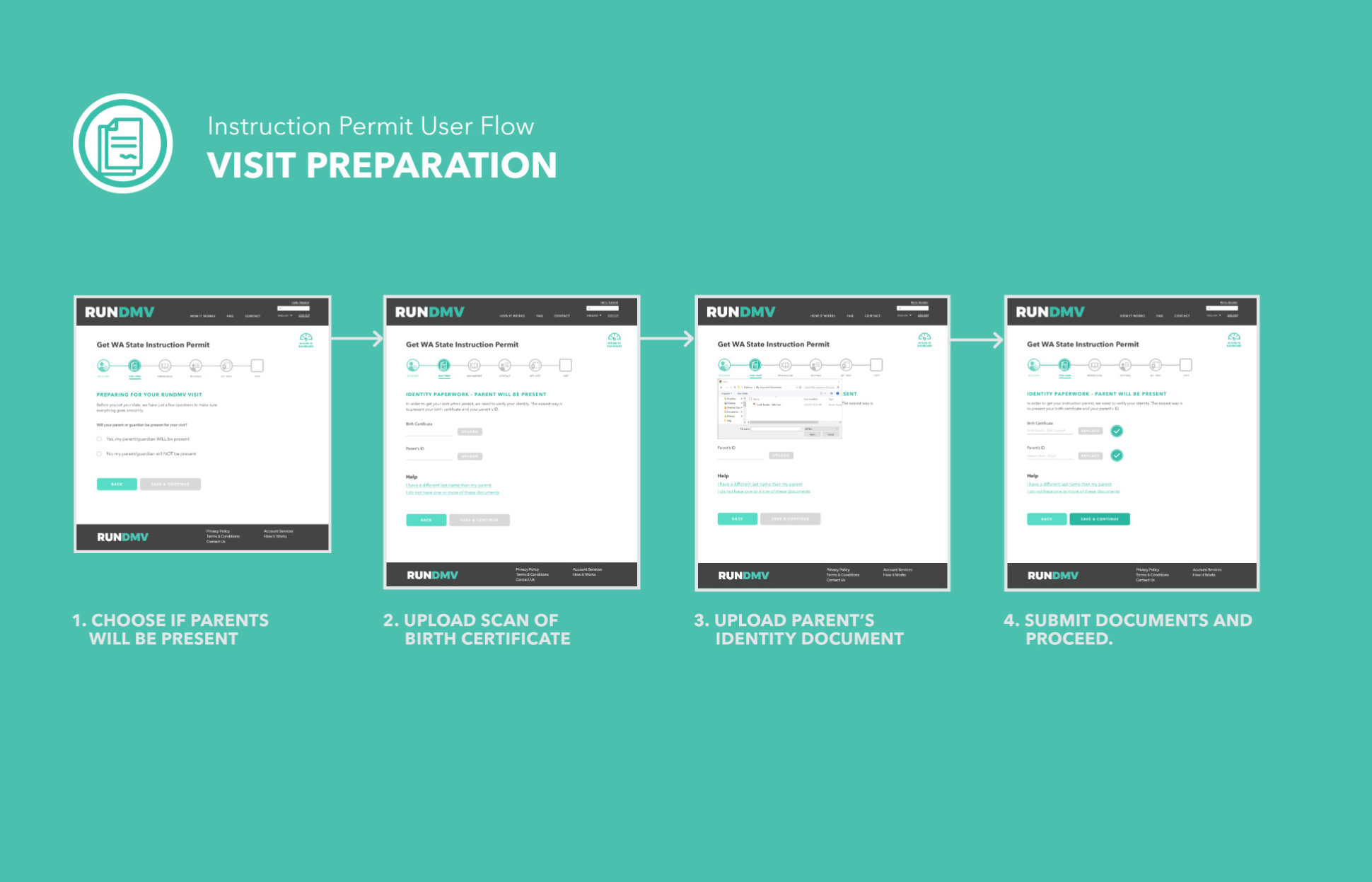
High-Fidelity Radio (Buttons).
We continued to build out our prototype into a high-fidelity, one key piece of feedback we recieved was to swap out our "large button" pattern that we had been using for "user's choice" scenarios. In order to be of maximum convenience Natalie and her parent or guardian, we opted to allow our user to choose whether or not the guardian will be present for the Instruction Permit visit.
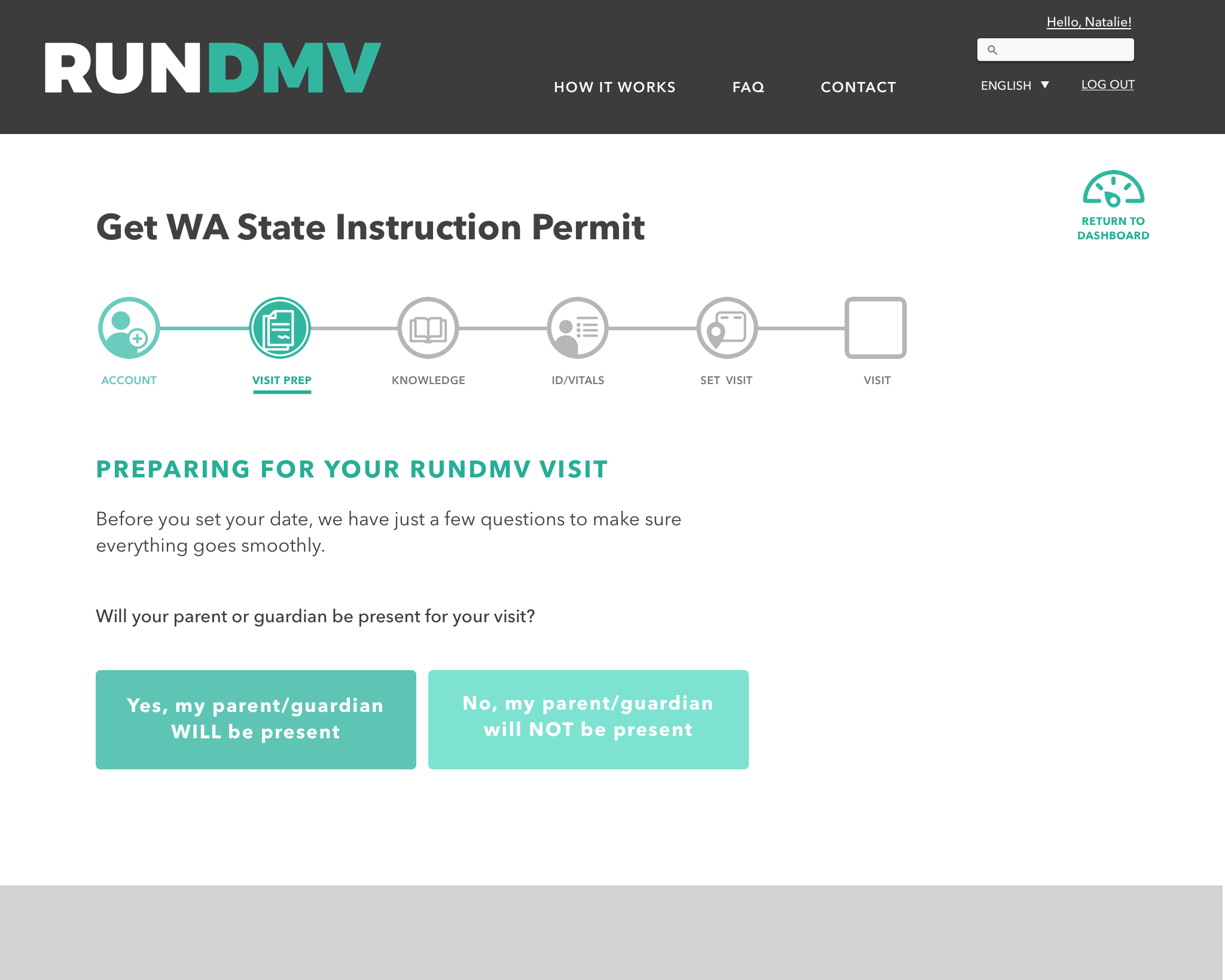
The Old Screen - this button pattern caused confusion for users.
However, when we used a button pattern on this page, we found it was potentially confusing to users, who may not read the entire text of the button. Instead, we switched the input pattern for this screen to radio buttons, to better ensure that the user considers their input before making a choice.
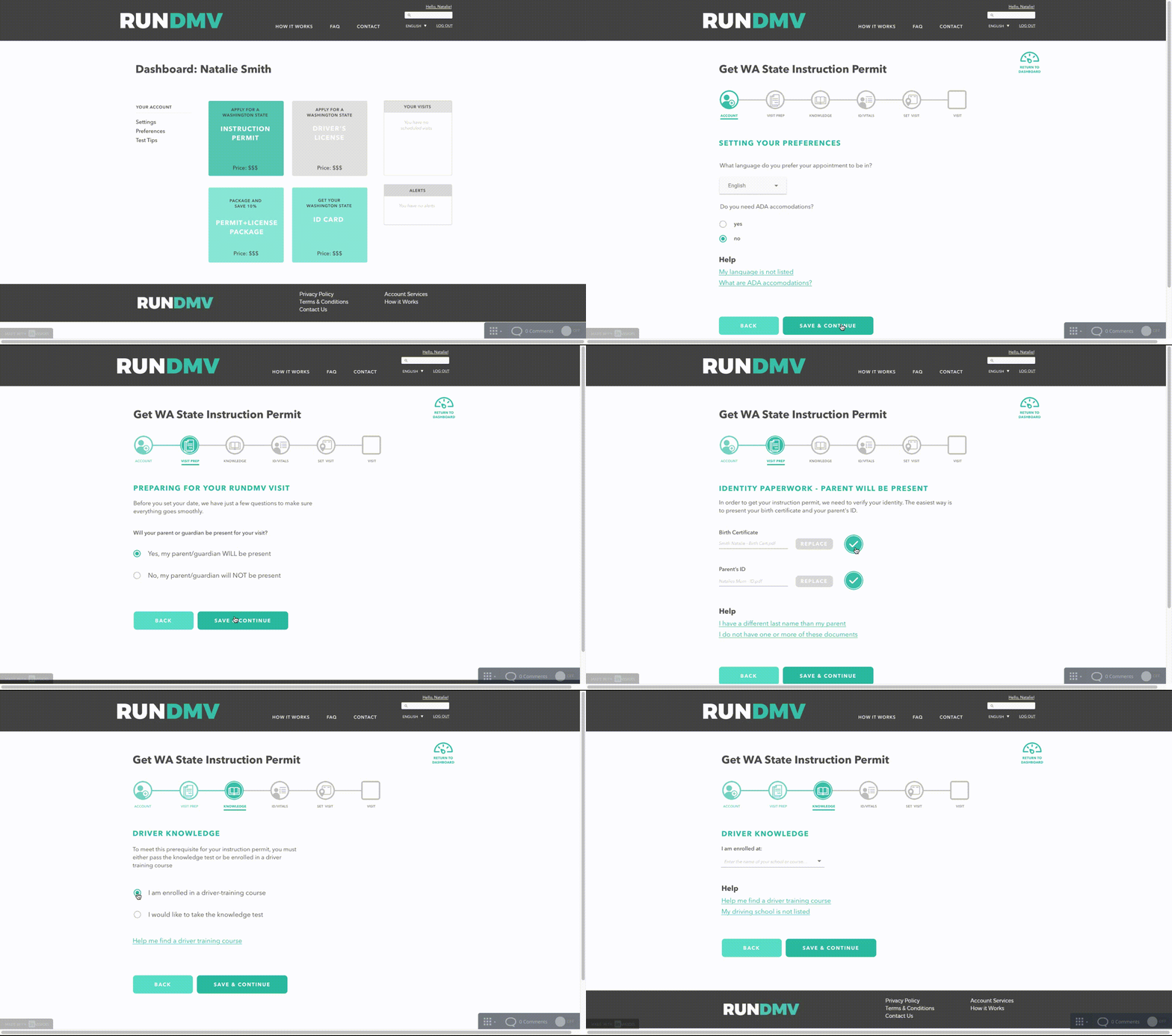
Updated Screen - Radio buttons make for more accurate selection.
Not bad, for government work.
Redesigning the model for a government service like the DMV may not sound glamorous, but our team found it to be an interesting and exciting challenge. I came out of this project with a great deal of empathy and respect for those on both sides; the diverse array of users, and the designers who build for them.