Branding, Visual Design, Environmental Graphics
Refresh the branding of one of Seattle's oldest rock-climbing gyms.
Founded in 1995, Stone Gardens is a rock climbing gym with two locations in the Seattle area. While their climbing facilities have been growing and improving for over 20 years, their vibe and branding have remained true to their industrial-Ballard-90's-warehouse origins. With new competitors popping up in the area, Stone Gardens could use a new look that feels fresh, but still authentic to the history of the old-school gym.
Create a visual identity for Stone Gardens that reflects the old-school climbing community while welcoming newcomers, and distinguishes them from competitor gyms.
To create a brand system that matched the character of Stone Gardens, we first needed to pin down what defined the gym's character.
We began by visiting the gym’s original Ballard location, interviewing employees and some long-time climbers. Stone Gardens is known in the climbing scene as the place to find the most challenging technical routes, but no one we spoke to mentioned that. When asked what kept them coming to the gym, everyone we spoke to said the same thing: “the community”. This illuminated to us the core of the Stone Gardens brand character: a humble, adventurous community.


What does a "adventurous" look like?
Once we had the character defined, we developed a series of graphic territories based around the characteristics we identified. The gym’s previous branding, we agreed, fell a little too strongly into the “humble” category; so we created a visual concept to amplify the bold, “adventurous” aspect of the sport to better express to newcomers what the SG climbing experience was like.

"The Climber" mark for the Climber's Gym
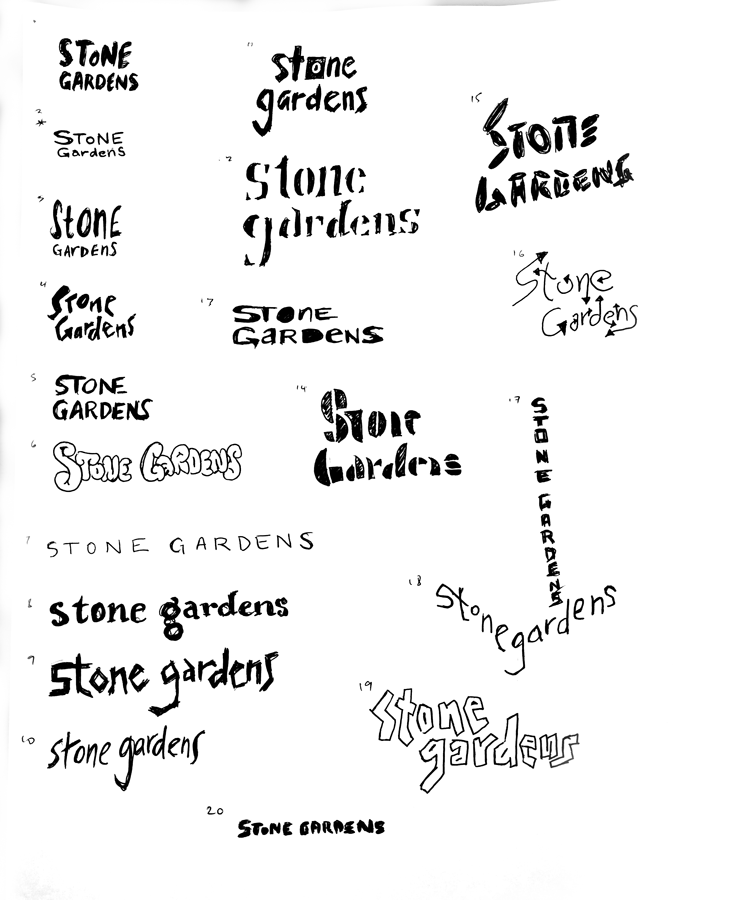
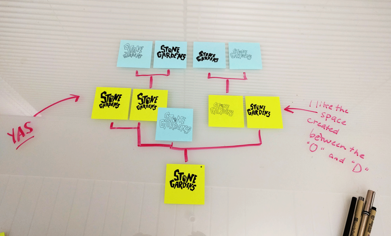
In creating the new brand mark, we worked through many sketch and modified type iterations to create a word mark that balanced technical structure with rough, hand-touched charm. From our primary stacked wordmark, I created a vertically-oriented “Big Wall” version, as well as isolating the climber mark for use in gym collateral and merchandise.
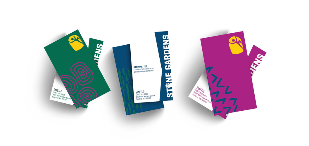
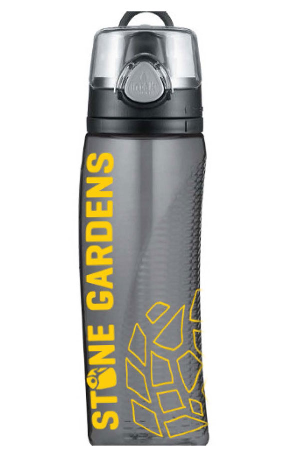
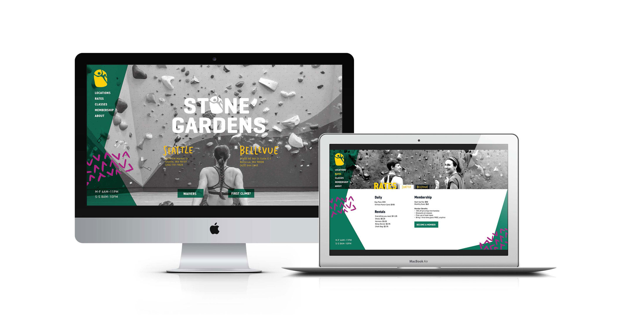
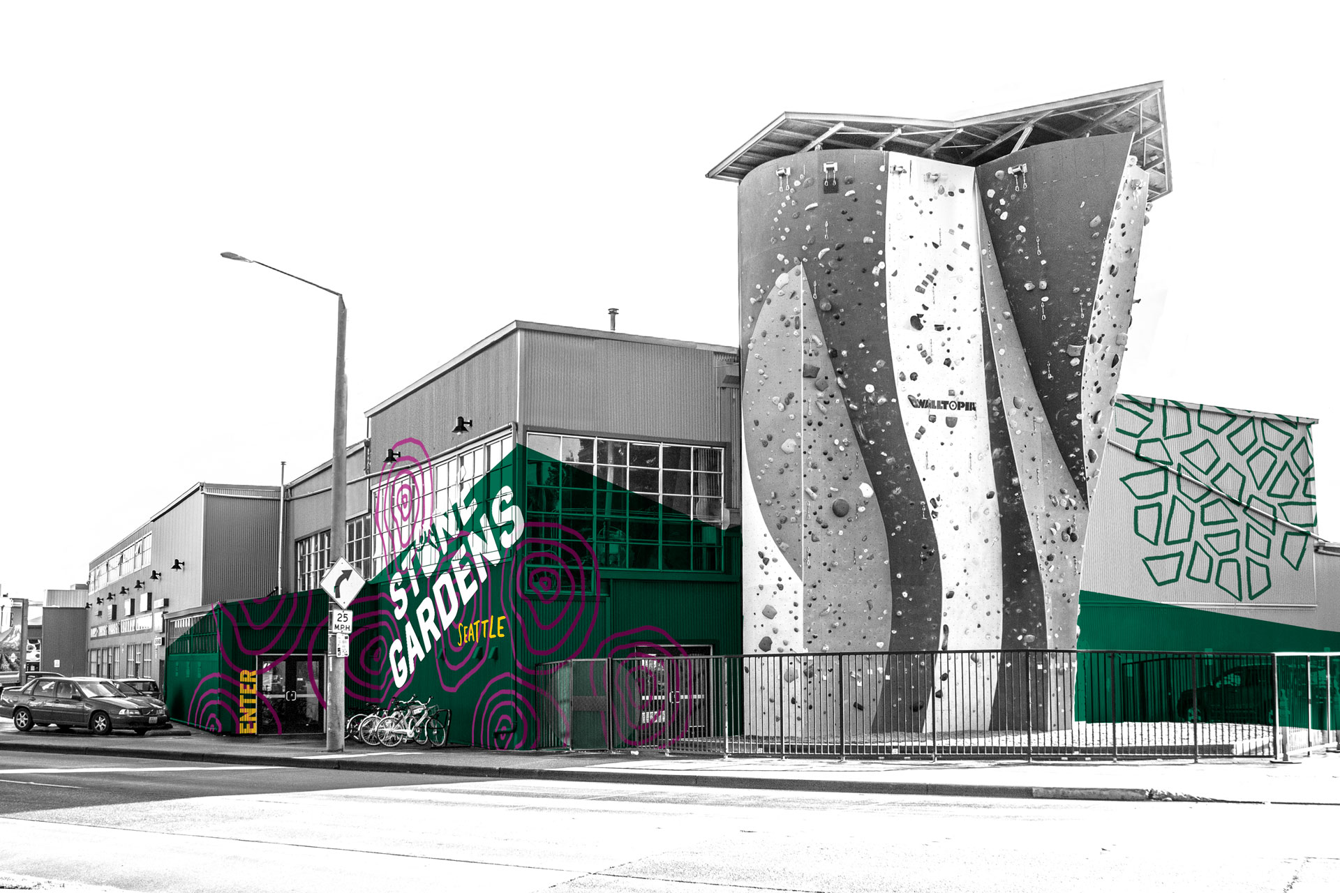
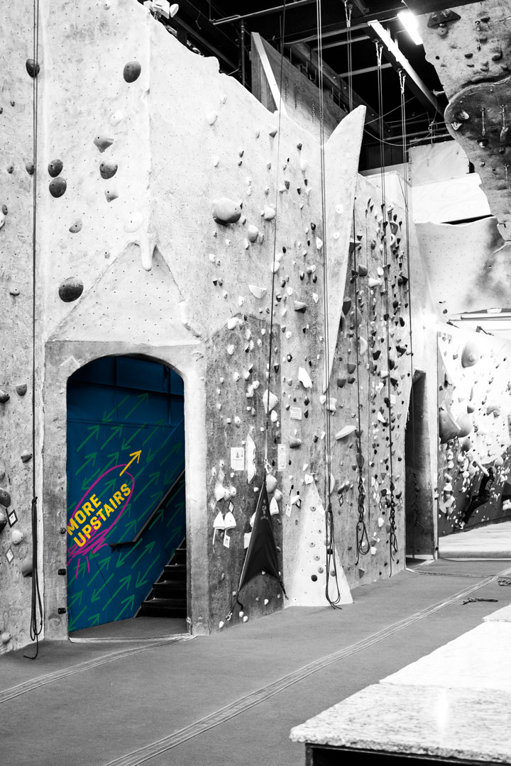
An active, adventurous brand like Stone Gardens doesn't live in a book; it should be climbing the walls.
Within the gym environment, the brand elements are used to invite visitors into the gym, and direct them to important features.
