UX / UI
Create a money management app that teaches financial skills to 9-14-year-olds.
Between the ages of 9-14, many kids start receiving a allowance, as well as gaining more independence that allows them to spend that money on their own terms. However, although tweens are maturing in some aspects, the area of the brain that controls long-term planning, is still developing.
Design an product that:
Engages 9-14 year old users while building financial literacy
Provides parents with an efficient, flexible way to oversee their child’s spending habits
Promotes successful communication about finances between parents and kids
Kids these days; what are they up to?
In order to understand our youth users’ goals around money better, Ivanna and I conducted interviews with 9-16 year olds. We also surveyed parents who were very interested in features focusing on education on personal finance topics. Our youth interview subjects were pretty mixed on that idea. Although half of the kids we spoke to admitted there were things about finance they had heard of but didn’t understand, they did not express much enthusiasm for a strictly educational model.
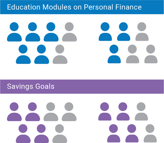
In the users we interviewed and surveyed, parents showed a preference for more educational content, while children were more interested in goal-setting features.
When we talked to the kids about savings goals, we saw much more excitement.slightly lower Each of our subjects had a goal in mind already, with an average (estimated) cost was around $750. These goals ranged from practical (“saving up for a car when I turned 16”) to whimsical (“I want to see what kind of Pokemon I can catch in Europe playing Pokemon Go”), but all of the goals our subjects talked about had a purpose in common: facilitating fun
Kids just want to play, Parents just want kids to take an interest in finance.
Using the data that we gathered, I created personas to codify our understanding of our two user groups. Parents are really looking to help their child learn and succeed, and we want to make sure that we’re sensitive to their concerns about technology, and the ability to supervise their kids as they grow. For the youths, we know they're curious and ambitious, but our approach with them can’t be strictly didactic, or they’ll lose interest.
I have big goals, but my income is small, and I sometimes struggle to reach them. I want to understand how money works, but I don’t want extra school. I take play very seriously, and having more money will enhance my playtime.
- Child Persona
My wish is for my child to learn and grow. Their success and safety matters to me. I want to understand the financial technologies they are using, and be able to keep an eye on them to make sure they are on the right track.
- Parent Persona
Striking a balance between Fun and Finance
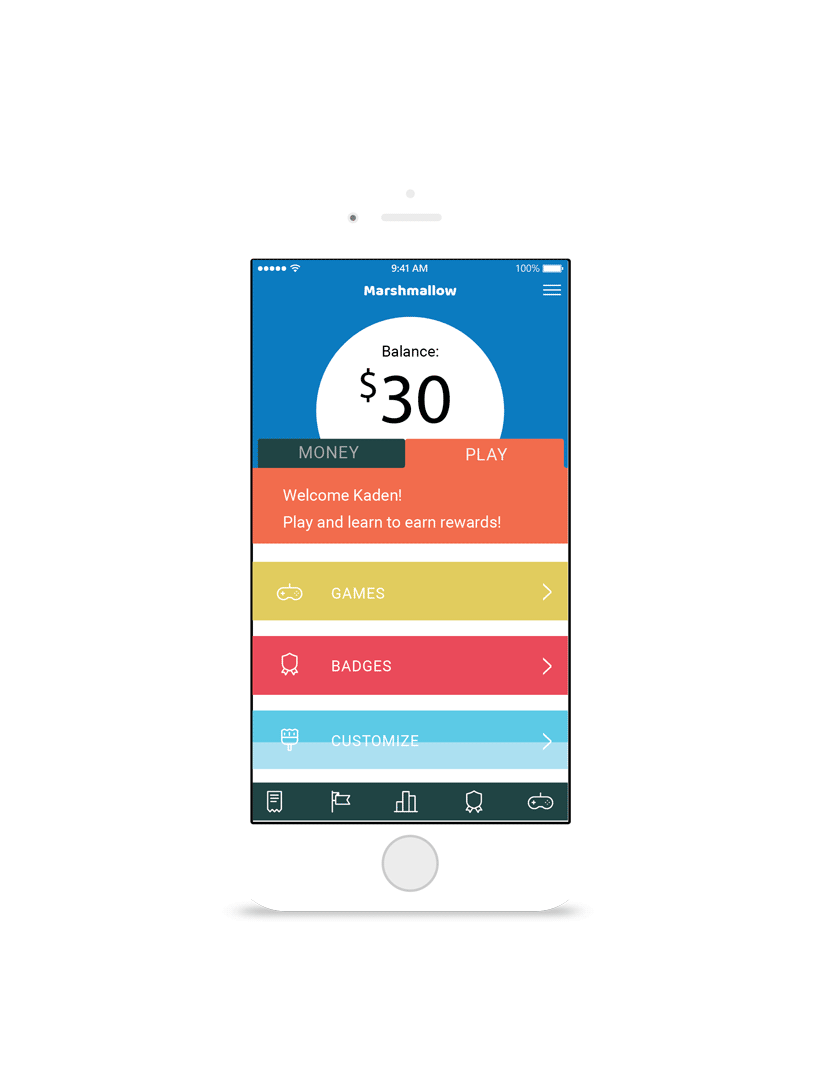
To help separate ourselves from conventional banking apps and to entice our tween audience to engage with the app, we decided to include a "play" tab in the child. Content for this tab would include achievement badges, mini-games, and customizable UI themes to give a sense of progression and rewards for reaching savings goals and finishing (secretly) educational mini games.
In order to satisfy parents and achieve our goals of educating kids on personal finance, we decided to embed learning functions within the features that our child users expressed interest in.
Overall, the goal with the interaction between the child and parent users is transparency: parents can supervise their tween as little or as much as they choose with customizable notifications about their tween's activity on the app. This transparency goes both ways, though; we don't want kids to feel like they're being spied on. One way to facilitate that is to show kids that there's an advantage to them for their parent to be checked in on their finances. We decided to demonstrate this by building out the goal-setting feature.
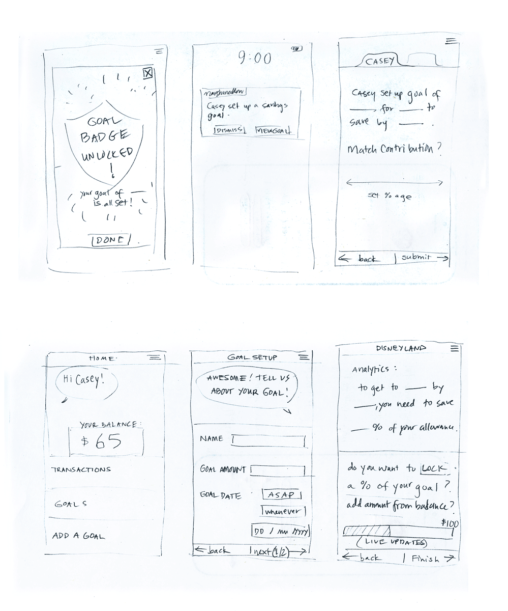
Transparency in Transaction.
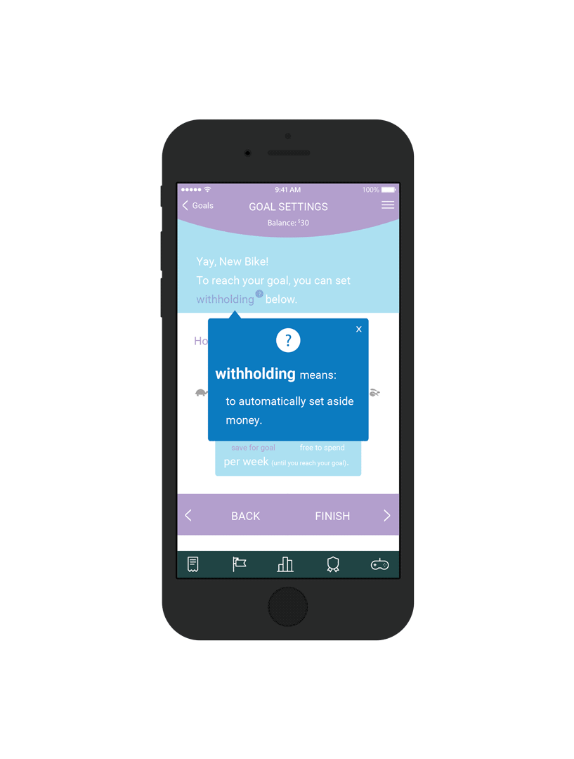
With our much-requested goal-setting feature, we aimed to design an experience which empowers our young users to set their goals, while introducing the financial concept of "witholding", or automatically setting money aside.
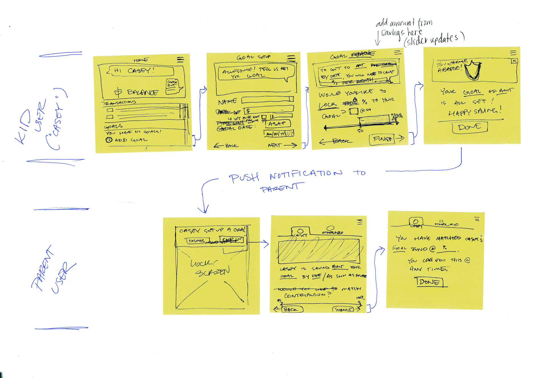
Ivanna and I sketched out a two-user flow where, when a child sets a goal, their parent is notified and offered an opportunity to match funds for their child's goal. This interaction between our two users, if successful, would accomplish all of our project objectives: educating kids, informing parents, and facilitating positive interaction between them on the subject of personal finance.
Learning what our users know (and what they don't).
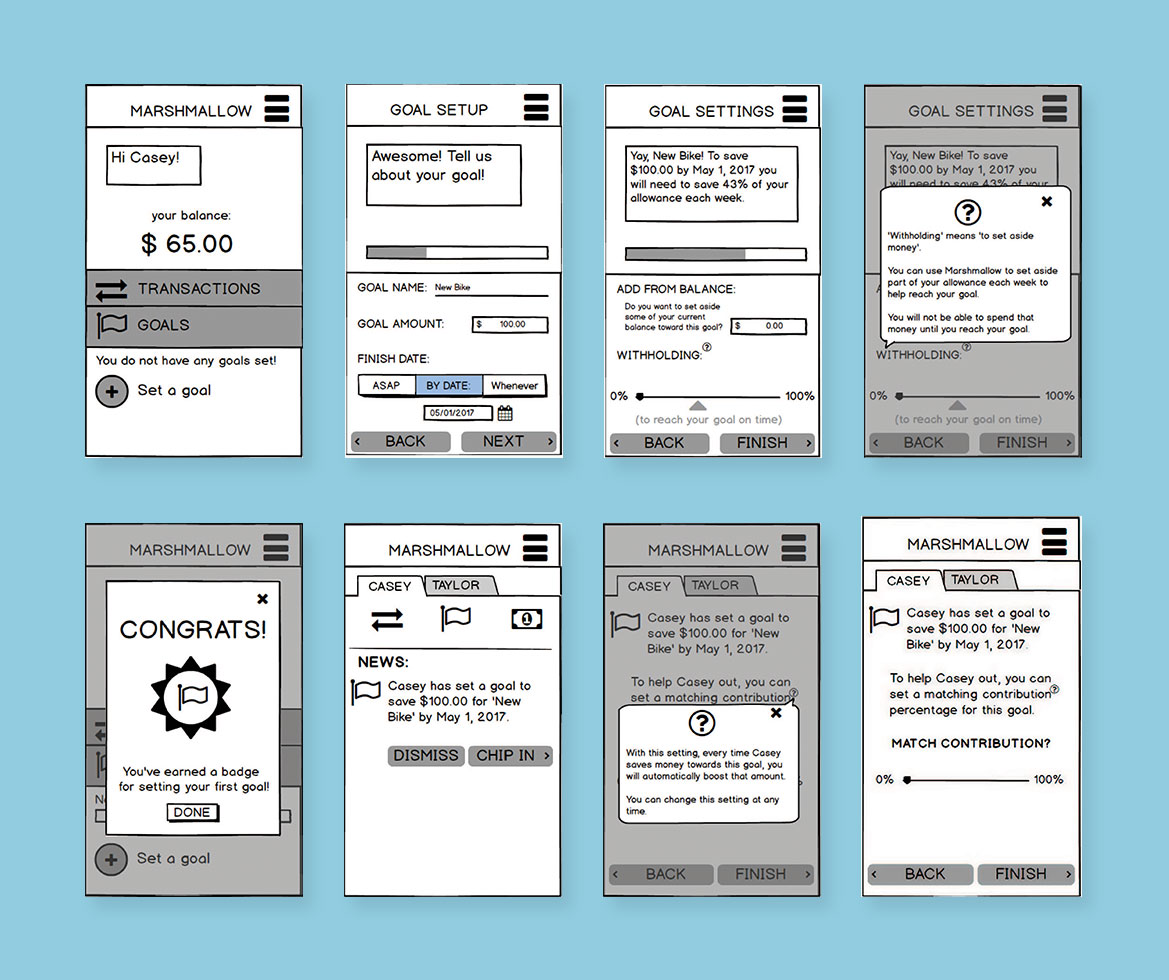
When Ivanna conducted a user test of our mid-fidelity prototype with an actual 9-year-old and his mother, our team gained valuable insight into our users. Our witholding slider showed the amount of income to be set aside as a percentage of the child's allowance. As it turns out, our younger users may not understand percents yet.
On the parent side, our mom user had the same note when setting up matching contribution. While the slider informed her what percent she would match, our user wanted to know how much she would be contributing to the goal overall. This seemed like a great opportunity for increased transparency on both sides, and lead me to revise our UI in the high-fidelity prototype to clearly display the amounts involved in transactions.
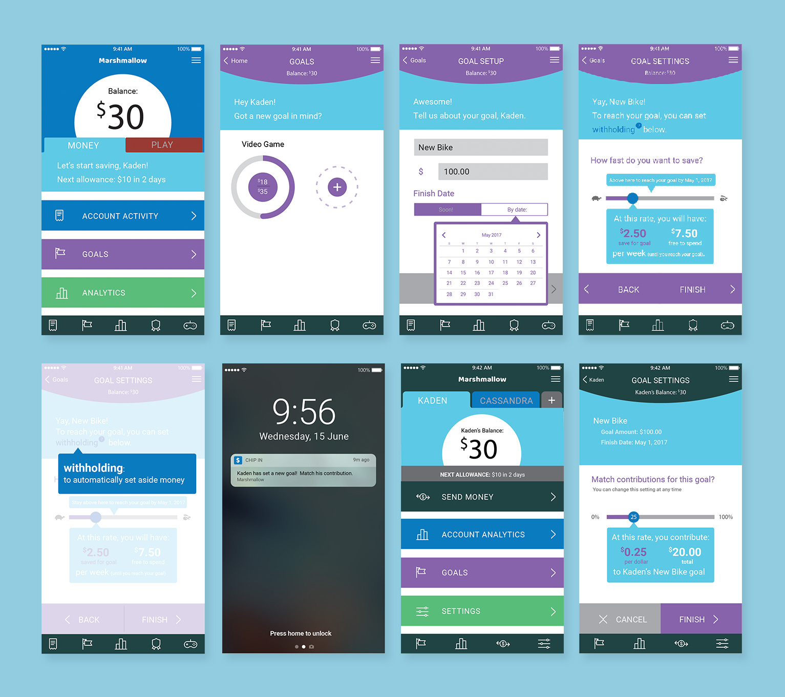
We incorporated our findings into a high-fidelity prototype.
Our high-fidelity UI was designed to take full advantage of our extensive brand palette on the child side, with a more restrained, mature look on the parent app UI.